A Simple and Honest Value Proposition
Your value proposition is the heart of your website. It is the reason someone chooses you instead of continuing their search. It does not need to be flashy or exaggerated. It needs to be true, concrete, and easy to understand.
When a website promises too much, it creates doubt. When it promises something realistic and delivers, it builds long-term relationships. Clearly explain what problem you solve, how you solve it, and what result the visitor can expect. Saying less — but saying it well — is often far more effective.
Guiding the Visitor With a Logical Structure
A good website structure works like a good conversation. It does not jump topics, overwhelm the listener, or rush ahead. First you introduce, then you explain, then you prove, and only at the end do you invite action. Every section has a purpose and prepares the ground for the next.
When content is well organized, visitors move forward effortlessly. They do not feel lost, confused, or pressured. For example, a service page that explains the problem, shows the solution, shares examples, and then offers a next step feels natural. When a website feels easy, conversion feels natural too.
Content That Answers Questions and Reduces Fear
Most people do not buy because they still have unanswered questions. Will this work for me? Is this trustworthy? What happens after I contact you? What if it is not what I expect? A high-converting website anticipates these concerns and answers them before they are asked.
Explaining your process, showing real examples, outlining what working with you looks like, and being transparent about limitations creates reassurance. For instance, clearly stating timelines or pricing ranges builds confidence. When people feel informed and understood, they are far more willing to move forward.
Nothing builds trust faster than seeing that others have already trusted you. Real testimonials, case studies, recognizable brands, or concrete results act as powerful reassurance signals. These do not need to be exaggerated or unrealistic to be effective.
Social proof is not about showing off. It is about guiding the visitor. It quietly says, “Others were in your position, and this worked for them.” When placed at the right moments in the website structure, this message has a strong impact on conversion decisions.
Social Proof: Let Others Speak for You
Clear and Well-Placed Calls to Action
A website can be well designed and well written, but without clear calls to action, it loses effectiveness. Calls to action should be visible, aligned with the content, and placed at key moments in the user journey.
The goal is not to pressure, but to guide. Tell visitors exactly what they can do next: schedule a call, request a quote, send a message. When the next step is obvious and simple, the decision becomes much easier to make.
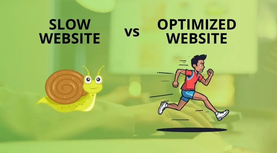
Design in Service of the Message
Design is not there to impress, it is there to help people understand. White space, readable fonts, visual hierarchy, and thoughtful use of color allow the content to breathe and flow naturally. A cluttered website confuses; a clean one communicates professionalism.
When design supports the message instead of competing with it, the experience improves. And when the experience feels smooth and intuitive, conversions increase almost without the user realizing it.